

Animation : The Herculean Task
Have you ever looked at an animation and questioned your existence? When you see those elements moving more smoothly than your life? It's alright, we've all been there.
But let me tell you a secret :
They're not that hard 👀
The Secret
Animations are just moving elements. Yes, it's a bit of an oversimplification but that's exactly what it is. And to help you conquer your fear we're gonna dive into it head on and understand one of the easiest ways to create transitions using the property transition.
Yes, very original, but let's get into it.
The Syntax
div {
    transition: <property> <duration> <timing-function> <delay>;
}
Let's break these down one by one
transition-property: Here we specify the CSS property to which the transition is to be applied like width, height, transform etc. Only properties listed here are animated.transition-duration: the duration over which the transition should occur.This helps us in defining how soothing or snappy the animation should be.transition-timing-function: This determines the function which defines how an animation should run. Most timing functions can be plotted on a graph by defining 4 points which are also known as cubic bezier.
Here's an example showing how each function animates an element
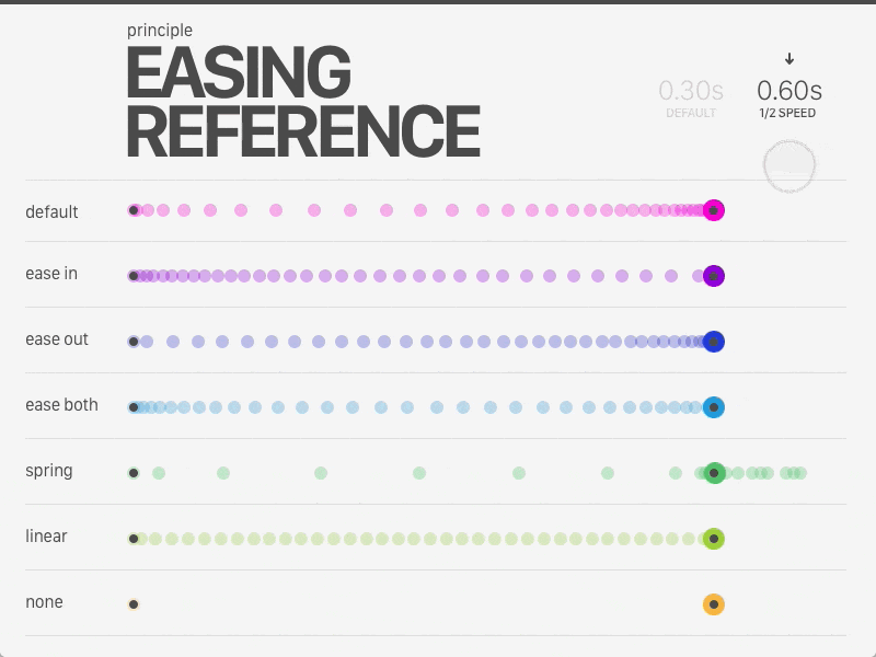
Note : Spring and ease both are not timing-types functions in CSS.
transition-delay: This helps us provide a delay before the animation starts , which is extremely helpful when you have multiple animating elements.
Now that you have understood what each term stands for, try playing around with it but before we do that...
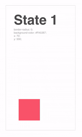
The initial state
When we imagine an animation, most of us tend to be in awe of it's moment, but if we slow it down an animation is basically moving from one state to another. So if your elements snaps out of nowhere because it's display:none is now block. Don't expect much to happen.
So when visualizing an animation, always have a mental picture in mind.
And now you're ready

Practice Session
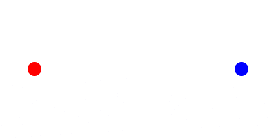 Knowing what you do now, think of what's happening here
I'll give you a minute.
Got it?
Wonderful!
So all that's happening here is an div is moving from left to right ( duh ).
Or more specifically, the position of the object is moving from left to right along the X axis.
Let's assume the initial state is 0px
and the final state is 200px.
So we have our transition-property : transform
Let's keep the transition-duration to 1000ms to see how it moves
And judging from the animation we can see that the object eases in fast and then slow
so transition-function would be ease in
We don't see any delay here so let's skip that. So our final transition formula would be
transition : transform ease-in 1000ms
So our final code will look something like this:
.circle {
position: absolute;
transform : translateX(0px) //The initial state;
transition : transform ease-in 1000ms; // The Exit Animation
}

.circle:hover {
transform : translateX(200px) //The final state;
transition : transform ease-in 1000ms; // The Entry Animation
}
And tada! You have created your first transition!
Congratulations! I know this seems like a small win but now you know how to break any animation down. Don't believe me?
Here's another challenge for you then :
Try replicating it and understanding how it works by breaking it down and share me the final result in the comments below.
Conclusion
No more cowering down to beautiful animations, look it into the eye and tell them you'll be just as smooth as them one day ! I believe in you!

Until Next time!